Tuesday, December 15, 2009
Disney
Lego
 Lego are a very well designed toy. They are very easy to use and you can make some pretty cool stuff out of them. I always liked to make airplanes and cars but who didn't? Airplanes wee my strong point though. I made an airplane one time that had a little over 3ft wingspan. The way that lego has made these, anyone can make something out of them. They are a fun toy for everyone to make something out of. They also come in very handy if you are wanting to make a stop motion animation film. There is nothing easier to use than legos. They are easily assembled and easily disassembled. Legos have been around for a long time and they are going to be around for even longer. I have Legos that my dad played with hen he was a kid. I don't think that Lego is going anywhere.
Danger: Wildman - The Devil Wears Prada
The Devil Wears Prada is a Christian/Metalcore band from Dayton Ohio. I chose this song to blog about because I really like the design of the song. TDWP does a great job of mixing genres a bit. They have a keyboarder that adds in synths/strings/piano and just about everything else he can add in. They make the song flow well and add in the electronic parts and it sounds amazing. Their music has exploded on to the scene the past few wears and they are a very well known band now. I think that they have a very unique sound and they stand out in a crowd. This song is one of the songs that they do a good job of mixing in the electronic sound into. This is also one of my favorite songs by TDWP. I realize that not many people enjoy the same music I do but I like the way that this song was composed.
iTunes
Adobe Illustrator CS4
 Adobe Illustrator is a fun and yet frustrating software at the same time! I like making different shapes and stuff on here but it gets touchy after a while. The zoom in feature not being a true zoom in (when you zoom in the perspective of the shapes is slightly skewed, you cannot notice until you zoom out), and the masks get a little problematic when you try and add new points in these are some of the problems I have run into with Illustrator. Other than those I like a lot of the features of this software. I like the fact that unlike Photoshop, Illustrator actually has an "undo" button that you can press more than once. Lots of people use Illustrator in the field and it is a common graphic design software. It it not as well known as Photoshop but it is just as useful.
Monday, December 14, 2009
Behringer V-Ampire Lx210
 This amp is very nice for the price. I bought it about 5 years ago for $200 and it is still going strong. I have played a few gigs with it over the years and have had to turn it up past the 3/4 volume point. IT still has good tone and is a good amp. For the price I don't know that you could find a better combo amp. The effects are very good and it has a versatile range of different amp settings such as the Fuzzy distortion setting al the way to blues settings. I have been very happy with how this amp has held up, considering it being an off brand. The only problem I have had with this amp has been the fact that my Treble and my Effects knobs came off. I am not sure when but I think it happened from transporting it everywhere with me. My amp has been anywhere from Carmel Indiana to Tampa Florida. It has been a good amp that whole time. I'm not sure when this amp was discontinued but it is no longer in production.
Sony In-Ear Headphones

I bought these headphones after have JVC Marshmallows. I loved the JVC's and figured these looked pretty nice also. I was right. These headphones have amazing sound. They have a great range of treble/mid/bass. The bass is very impressive for in-ear headphones. They also do a decent job of noise canceling. They are not made to noise cancel so obviously they don't do that as well as other headphones. I have then in right now as I blog actually. One thing that I absolutely love about these headphones if how comfortable they are. I have fallen asleep with them in before and when I woke up my ears did not hurt as they had with previous headphones. I like the sleek look that they have and these headphones are prefect for my needs. I listen to Metal/Alternative/Rock/Hardcore so bass is definatly in important thing. Lots of the music I listen to have lots of bass drops. I would recommend these headphone to anybody.
Vizualtech Design's Volvo C30 Widebody

Samsung Highlight
 I finally got a new phone after my Nokia started falling apart on me. I wanted to catch up with technology and get at least a partial touch screen. What I ended up with is the Samsung Highlight "Fire" phone. This phone is very nice. Its touch screen isn't responsive to static or heat but actually senses the touch of you hand. You have to push down to click on stuff but that is fine with me. One of the advantages to the screen of this phone is that you can still control everything with gloves on or something covering your hands. I absolutely love the color orange on a phone so it was no surprise to any of my family that I ended up with this phone. The back cover on this phone is textured and actually quite grippy and doesn't want to slip out of your hand. All of the reviews online about this phone are very positive. It has smooth menu's and everything flows pretty well on the Highlight. The camera is 3 mega pixels and takes surprisingly good quality photos. The only problem I have with it so far is that the phonebook will not let me scroll past the letter "U". I am going to have somebody look at that next time I go to the T-Mobile store. Other than a that this phone is pretty awesome. I would definatly recommend it if you want a well priced touch screen that still can do almost everything.
Tuesday, November 24, 2009
Power Point
I have major issues with Microsoft Power Point. It doesn't seem to like to cooperate at all. There are good things about it such as the linking feature were it is easy to create lets say, a game? It starts getting a little hairy once you get into around 70 slides all linked together? Right about that time is when it decides to switch some of the links on you to keep you on your toes. It does a very good job of making you have to pay attention to detail. I think that they need to work out a lot of bugs. If your computer has been shut down or sleeping for a while. You have to reset all of the links for music/sound effects/other slide shows/etc. Compatability issues are my biggest problem. Microsoft really needs to figure out how to get mac files to run cleanly on windows. I sent my project to my brother to test it out on his windows and all of the links had been changed and it didn't work. Imagine that? A project that decides to not work when you need it too. It also boggs my computer down like crazy. I thought it was going to crash. I found numerous websites that talked about not liking how Power Point runs. "Power Point, make an awesome looking slide show/game only for it to not work when you need it too!"
Wednesday, November 18, 2009
Face
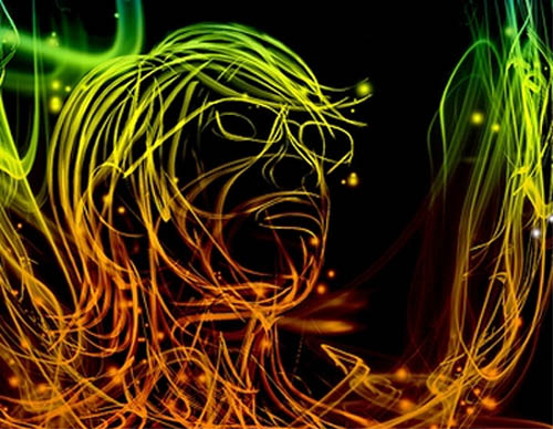 I'm not sure who made this or why but this is cool looking. It is a line version of somebody with glasses on. I like how this whole design is made. They put a color gradient from a light green at the top to an orange color at the bottom. There is a good mix of positive and negative space. it is framed well and is a very beautiful picture.
Wednesday, November 11, 2009
Celtx
 Celtx is a free scriptwriting software that you can download offline. It is an easy way to write scripts. It has a few different options for Title, Action, Dialogue, etc. If you don't know, script writing is very much about the formatting. You can do it in Microsoft Word, but it is going to take you some time. Software like Celtx makes it easy to format. It makes your scripts look professional. In a lot of cases if you send scripts in to companies to read, the ones that get thrown out first are the ones that are formatted poorly. There are softwares you can pay for that are good too such as Final Draft. I had the trial of Final Draft and loved it. Being a college student with no money made it hard for me to justify buying it, so I went with Celtx. I love the way Celtx works. It takes a little getting used to but once you are used to it, it is a breeze to write up your scripts. From reading online blogs, forums, surveys. I have determined that Celtx is a more popular software. Final Draft is always going to be an industry standard, but while your scripts are still underground why spend the money?
Breaking Benjamin's Symbol
 I have always wondered what Breaking Benjamin's symbol was and what it meant. I thought that this would be the perfect type of thing to put in my blog. Through researching I found out that their symbol is the "Celtic Knot". I also found out that this design started to get popular in the late Roman Empire. There wasn't much written in history about the meaning of the celtic knot. According to whats-your-sign.com the celtic knot is a symbol of the endless time of nature. There is no beginning or ending in the celtic knot. It can be a protection symbol, warding off sickness and setbacks. This symbol works good for a band symbol. It is a symbol of protection and it also is a symbol of endless life. Breaking Benjamin could have chosen this symbol because they wanted there music to last forever.
Vertigo Shot
This is one of my favorite film techniques. This is the vertigo shot. The vertigo shot is made by a mix of zooming in and moving the camera backwards, or zooming out and moving the camera foreword. It makes for an ominous feeling shot. It is commonly used for a revelation in the story or for fear. The shot was developed by Irmin Roberts. Roberts was a Paramount second unit camera man. His technique was first used in Alfred Hitchcock's Movie "Vertigo". Giving it the name "Vertigo Shot". This in camera special effect is now used commonly amongst films now. FIlms such as: Event Horizon, Pulp Fiction, Undercover Brother, Lord of the Rings: The Fellowship of the Ring, Etc. I have even used it in my films.
Wednesday, November 4, 2009
EXIT!
 Exit signs. I am going to analyze the design of the standard exit sign. Now there are two different styles of exit signs. There are exits signs that are green and exit signs that are red. Now why is this? Both of these colors communicate two totally different feels. Green usually communicates: abundance, growth, nature, and it is a cool color thus feeling calm and laid back. Red however communicates: violence, war, blood, and it is a very hot color signifying urgency and fear. Why are both of these colors commonly used amongst exit signs? I can see maybe why green would be used. It could be used to calm the people down as the exit, maybe this would be better for younger crowds. Red would be good during emergencies, it would communicate urgency and people would automatically run to them to get out. So why don't they invent an exit sign that changes from green to red according to the situation? This type of exit sign could be affective. When there is an emergency, the sign could change to red.
Adobe Photoshop's Clone Stamp Tool
 I love this feature in Photoshop. From research I found out that this tool has always been a feature in Photoshop. This tool is an amazing design. All it really does is take a selected spot of pixels and clone them to wherever you want on the grid. It makes it easy to replace different things. You could take someone and essentially erase them strait out of the photo. It is genius. It is such a simple design but nobody had thought of it before, or at least never mass produced it. Once again I could not find facts on the popularity or this particular tool. There are a lot of tutorials for it online though. Making me think that it probably is pretty popular if lots of people are wanting to learn how to use it.
GarageBand
 GarageBand by Apple is one of the easiest music editing softwares there is. Apple does a good job of making different things a lot easier to do in there softwares. GarageBand is my favorite. Within minutes, you can create almost any style of song you want to. There are instruments such as: stringed instruments, sythns, guitars(as crappy as the distorted ones sound), pianos, drums and many others. I can sit on this software for hours and just create music.
There are a few issues I have with this software. I have had problems with recording my guitar. I don't know if it is the software or the amp but it seems that the recording speeds up and slows down. It makes things difficult when I am trying to right songs. I enjoy Metal/Rock/Hardcore. Witch requires heavy distorted guitar which GarageBand doesn't exactly supply. It is more fun to record yourself playing than using software anyway. Another issue I have with it is the fact that the strings take a long time before they start playing. I have tried to make "Epic" sounding songs that require instant play from the strings and it just doesn't happen. There are ways around this but they are time consuming. One of the major problems is if you have "Too many instrument tracks". You will be trying to play a project through and it will stop in the middle of it popping up a box that says "Part of the project could not be played".
Overall they have made music making more easy for the consumer with this software. All of my friends that have Macs use GarageBand. It is fun and easy to use.
Bloons Tower Defense 4
 Bloons Tower Defense 4 has a very clever design. They improved on some things that were frustrating in the last ones and made it more fun. This game is free and online. They added different characters and different upgrades. In this version of BTD, you have to rank up (you rank up by popping a certain amount of bloons). By ranking up you unlock more characters and upgrades for the locked characters and for characters you already have. I think that most people would agree that games with goals are more interesting to play. It is always more fun to have to unlock stuff and then use those unlocked items to upgrade stuff. Out of all of my friends, 90% of them have or currently play BTD.
Monday, November 2, 2009
Digital Penguin

In searching the web for “Digital Penguin”. I came upon this image. In researching a little more I found out this is in fact a Christmas ornament. It is called the digital penguin ornament because it looks like a penguin and yet for some odd reason it has a 1.5” LCD screen in its stomach. From researching I found out that penguin ornaments are pretty popular among Christmas ornaments. I could not find demographics on this, but I found a lot of websites that subjectively state that penguins are popular as an ornament. I also found out that digital screen ornaments are just as popular, so why not put the two together and create this Frankenstein style Christmas ornament, that is a penguin with a digital screen in its stomach.
Digital Candy
 Here is an example of digital candy that I found on google images. I think that it is a perfect example of digital candy. I personally don’t like digital candy, it makes me want to eat it, but I can’t. Digital coming from the Latin word “digitus” meaning literally fingers, toes (digits). Digital means: Relating to or being a device that can generate, record, process, receive, transmit, or display information that is represented in discrete numerical form (digits). Candy meaning: Any of a variety of confections made with sugar, syrup, etc., often combined with chocolate, fruit, nuts, etc. So together Digital candy basically means: A confection made of sugar, syrup, etc represented by discrete numerical form or digits.. Digital candy, you can’t eat it but it sure looks good.
Wednesday, October 28, 2009
Sin City
 This movie has a very interesting design in color. It is very distinct looking and would be easily picked out in a crowd of screenshots. Frank Miller has been known for crazy looking color corrections. This movie is one of the most interesting looking films ever. I personally love the look of it. I have many times tried to recreate the extreme black/white/red look of it. I now know how to do it but, it took a lot of time for me to figure out. I think that this "look" would not work for all movies, but it works for this one. The movie is known for its look rather than its story. This color correction works really good in a movie with lots of blood, or red clothing in it. This movie has both. Obviously it was no mistake dressing the girl in red, but it still adds to the film. The red stands out like crazy and it gives more meaning to the red. It helps the filmmaker to make something stand out that might have been looked past in normal color correction.
Forza Motorsport 3
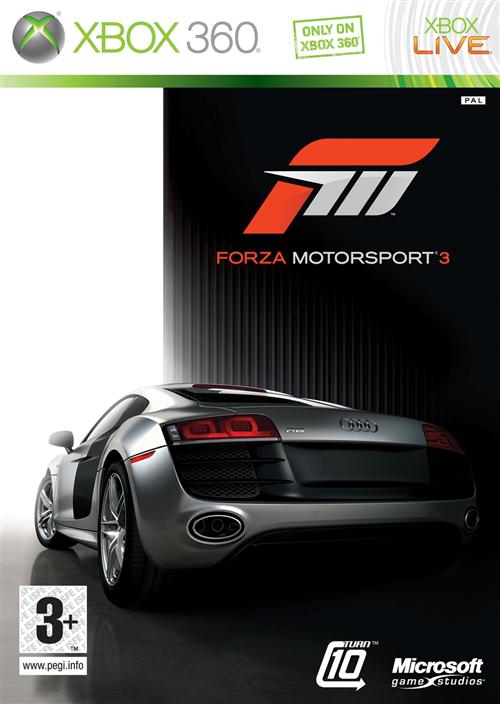 So I have sort of started a video game car theme lately, and this is a combination of both. I pre-ordered this game a few weeks back and have been eagerly waiting for its arrival. I absolutely loved Forza Motorsport 2 and hoped for similair gameplay in this one. I finally picked it up at midnight on monday night/tuesday morning. I played it until 3:30 in the morning and didn't want to stop. The only thing that held me back from staying up all night is the fact that I had a math exam on tuesday. The gameplay in this is amazing. They improved on a lot of stuff this time around. The graphics are just amazing. It is one of the most realistic looking games i've seen. The way that the cars handle in this game is better than the 2nd game. The handle incredibly realistic. I have not driven an Audi R8 in real life, but I would imagine that it would handle like it did in this game. One thing that lacked in Forza 2 were the backgrounds of the tracks. That is one thing they greatly improved on in this game. The background just blew me away. On the track "Maple Valley", It is set in a fall time period in a forest and the trees look really good. Their leaves are red/orange/yellow. It makes you think that it is fall when you race there. If you look too much though, you wreck. Another feature that is very useful in this game is the "rewind" feature. If you hit another car and dent your bumper, you can rewind back to a certain point and try again. I think this feature is genius. In the old game you would always strive to not hit anything to get the bonus at the end of the race. In this one you can try a few different ways if you mess up. Another thing in this game is that they have a little more variety in race styles. There are drift and drag races on top of the standard circuit races.Overall this game is a huge improvement on the last one, I can't wait to get farther into this game.
Take It All Away-Red
http://www.youtube.com/watch?v=iAHCsyOb3Rc
This song is "Take It All Away-Red". The design of this song is amazing. You probably didn't think that songs have designs, but they do. They are composed, recorded, and edited later on just like a graphic design or a video. More a video but the principle is the same. I love the layout of this song. It is laid back, calm, and slightly dark sounding all the way through the song, up until the end. If you have never heard the song before, I would recommend listening to it. I love the structure of this song. It is slow and acoustic, and then builds up and explodes into an amazing, powerful outro. I have heard a few artists do this before in songs, but Red really harnesses this structure and ended up designing an amazing song.
Nissan GT-R
 The Nissan GT-R. This car is my favorite. I have loved Nissan Skylines since I was a child and was ecstatic when I found out they were bringing it back to the states. They changed the name to GT-R, big deal. The design of this car is amazing. It has a sort of commanding aggressive look to it. The "face" (as discussed in class) of this car is mean looking. I would probably have hated it if it looked happy. I like how it is very sleek. Its low and wide, two features I love in cars. The overall attitude of the car is just powerful. The stock 20" wheels add to the look of the car a lot, and the quad exhaust just looks amazing. The price is another amazing feature of this car, starting at $80,790, this car out performs most porsches and all corvettes. They changed the body style a lot from previous Skylines, but they kept the signature quad taillights. There are different driver settings for this car. You can set it to automatic, or semi-auto, or racing semi-auto. Then you can adjust the suspension from luxury to racing. Then you can even turn off different safety settings to make it act more like a race car. Overall this car is amazing, design, price, attitude. This car is amazing in every way.
Wednesday, October 21, 2009
Borderlands
 My little brother pre-ordered this game a few weeks ago and picked it up yesterday. My older brother told me I should try it and it is the most fun game ever. I was kind of skeptical. My thoughts were along the lines of "Well it must be pretty good, but there is noway that it is the most fun game ever." I tried it last night and wow. This game is absolutely amazing. The game play is a little bit different to get used too, especially if you have "Halo reflexes" as I call them haha. I get attacked by stuff in this game and accidently throw a grenade at something 2 ft in front of me. instead of re-loading my gun. This game has everything you want in a game. It not only is a shooter, but you have vehicles, kind of have a home base, an unlimited amount of weapon choices. This game actually has its own software engineered into it, where it generates its own weapons. The creators of tis game will play it and find weapons that they have never seen before. I think that is one of the coolest ideas ever. It also makes it fun because you can try and collect different guns and compare them to your friends guns and its awesome. Another feature with the weapons thats cool is the fact that the weapons have different rarity ratings. It goes from a scale least rare to most rare. The scale goes white-green-blue-purple-orange. I haven't gotten any orange weapons yet but I have a purple one haha. The amo is over abundant in this game also. You never have enough room to carry all of the amo that you find. You also can buy and sell weapons. One feature that comes in very handy is; If you sell a something you didn't mean to sell, then you can buy it back for the same price as you sold it for. You can only do that while you signed in to the machine that buys and sells, but I think that feature is genius. I can think of many times in games when I have sold something that I can never get back in that game. It makes me very unhappy. They have thought of almost everything in this game.
 The only thing that I don't like about this game is the fact that you cannot customize your character that much. I mean sure you can change weapons and some colors of your clothing, but you cannot change facial features, clothing styles, hair color, etc. All you can do is choose from a few different characters. I really don't mind too much though. They made this game so awesome that you kind of forget about not being able to customize your character.
The cover art for this game is pretty awesome as well. The red background and the screenshot in the blood splatter is very well put together. It makes you look at it a few different times just to figure out what exactly is happening. It is not natural looking, but yet it is intriguing. It really draws you in.
All in all the game makers went all out in Borderlands. They really did think of absolutely everything when designing this game. The cover art makes you want to buy it, and the game play makes you not want to stop playing it. It is very addictive, but I don't mind getting addicted to this type of game.
Nokia 5310
 I bought this phone last year because I loved the design of the exterior. I researched it before I bought it, but there was not a whole lot of reviews or info due to the fact that it has just come out. In my eyes, it was orange (my favorite color) and it had an mp3 player on it (I love music). I thought that this phone was everything I wanted.
 Well unfortunately I found out quickly it wasn't. It has all kinds of glitches and flaws in its design. It is made more sleek and small so that it fits into pockets easier, which I like. The problem with it being small, is the fact that the first time I dropped it (about 2 1/2 ft), it broke the back cover. It didn't break it in half or anything like that, but it broke the clips on it so that it now hangs off in the one corner of the phone. Another problem I have had with this phone has been texting issues (everybody I've talked to that also has this phone has this problem as well). It locks up during texts, and after it locks up, the screen goes black then it resets the screen.
Some of the features I like about this phone is the mp3 player. It has very good quality sound. Even the built in speaker has good sound with receiving texts and phone calls. It comes with some very cool graphics for backgrounds, screen savers, etc. When talking to someone on the phone, the sound is very clear and easy to understand that person, unlike my last phone.
Overall I really like this phone, I just hope that they re-design some of the issues it has and make it amazing.
Facebook's Home Page Layout
Monday, October 12, 2009
Photo Booth
The Snuggie
 The Snuggie is a blanket that has sleeves so you can still talk on the phone, eat, text, etc, all while comfortably cuddled up under your Snuggie. Not a bad idea for being around the house. The way it is advertised however is a little different. They show people at football games, and public events with these stupid looking things on. Who in there right mind would wear one of these to there sons football/basketball/baseball/soccer games? I would feel awful for the kid whose parents wear these things to his outdoor sports event. I am sitting on my couch right now under a blanket with a sweatshirt on to keep my arms warm, sounds like I could use a Snuggie right? I would have a hard time choosing from all of there "fashionable colors" as they are advertised haha. Overall good design, bad marketing strategy.
Monster
Tuesday, October 6, 2009
Super Scratcher!!!
 At my house there are a total of four cats. Yes I live at home and commute to college. It is just cheaper. Back to the subject. My Mother enjoys buying lots of ridiculous cat products that the cats are hardly interested in. Until she bought the Super Scratcher. All of the cats absolutely love there things. My cat (I went to college in Tampa, Fl, lived in an apartment and adopted a cat from the humane society to keep me company. She has three legs.) heard my mom set up a new SS and came running in the room, diving on the SS and knocking off the other cat that had been sitting on it. It was one of the funniest things I have seen in a while. Bottom line is that the cats love these things. They are a great product. The only downfall is that you get some cardboard shreds around the house but they are easily vacuumed or sweeped up.
New Heinz Ketchup Bottle
 There are advantages and disadvantages to this new ketchup bottle design. Some disadvantages are that when you are trying to get the ketchup out you kinda have to squeeze hard and when it finally comes out it shoots with a lot of force behind it, potentially staining nice clothes if you aren't careful. Also if you are picky about food mixing (like I am) it also can get ketchup on food that you don't want it on.
 On the other hand, there are more advantages than disadvantages. This bottle eliminates the watery ketchupy stuff that you get with other bottle designs. This bottle design fits into your refrigerator door a lot better (which is what it was designed for). The top of this bottle doesn't seem to clog as much as the older versions. Also the top doesn't get covered in nasty ketchup like older bottles. Overall this design is a lot better than the older one. The fact that it doesn't get that watery stuff at the top sells me on the design.
Quad Bookcase

I found a picture of this thing online and wow is this crazy looking. I actually think as radical as this design is, it might actually be somewhat useful. Not exactly practical but useful. I think that you could possibly fit more books into a conventional shelving unit but none that look as cool as this. It mounts the books at angles, if you put the book in right, it would make it easier the titles easier to read. This shelf would look very nice in a modern decorated home.
Monday, October 5, 2009
Pool Vacuum Hose
 This is a pool vacuum hose. Many of you probably wouldn't recognize it if you saw it but thats what it is. I work as a Pool Technician during the summer and have for the past 3 years. I work with one of my best friends ad we always complain about these hoses. They are stiff and tangle up and collapse. They are incredibly hard to work with. You have to twist them until they are perfectly straight otherwise the make your life difficult. My friend and I have not yet come up with the solution or a new alternative to the vac hose, but we are working on it haha.
Dentist
I came upon this the other day and couldn't help but blog on it. This is the worst idea for a logo ever. It conveys the message that they are going to rip your teeth out! Not only that but with there bear hands and not surgical tools. I guess it probably wouldn't have looked any better with pliers holding the tooth either. This is just awful though. If I went to a new dentists office and saw this on the door I would most likely walk back to my car and speed out of the paring lot. The colors are inviting and give a relaxed feel but the design counters that feeling.
Fedex Ad

I came upon this ad while researching for a different class' project but I decided to blog on it. I think that this is an amazing design. This design sends a message to you. It communicates to you that Fedex Is a fast efficient service that will get your delivery places fast and safe. It reminds me of old cartoons when the characters would dig to china. I think they had those cartoons in mind when they created this design. It suggests that they have sent this vase around the world. I also like the way its put together. Very visually pleasing to the eye. They have arranged everything at angles oppose to vertical or horizontal lines. Diagnols are always more interesting I think. It also draws your eye to the Fedex on the side of the box which is exactly what they wanted to happen. So in my opinion this is a very successful, affective ad.
Sunday, September 20, 2009
I don't know
 I came upon this awesome looking design online when I googled the words "cool design." This design kind of reinforces my theory of not all design having a direct meaning or purpose. Just look at this it looks awesome. I think that gradients always ad to designs like this and I like the whole way it sort of draws you in. I don't exactly know what this is or what it means, but I think thats why i like it so much. This design does not mean anything at all. It is simply just a design that someone randomly threw together in some form of software. How can random shapes look so cool? I don't know, but I do think that this is one of the coolest designs I have seen.
Greg
Segway
 The Segway. I think that this is a terrible design. What happens if you hit a bump? It looks like you could try and go to fat and fall off of the front if this thing. Now the woman in the picture seems pretty happy with it but thats besides the point. This is the epitome of the word "lazy." I don't want to say that everyone that owns one is lazy but a design like this would have never made it past the idea if it hadn't of been for lazy people. I would maybe try one sometime just to see how it is but I would never want to own one. Quick funny story, my friend gives Segway tours in downtown Indianapolis. He said that very commonly people who don't know what they are doing cruise right into the canal haha. I guess leaning back is a tough concept to grasp. Back to the subject. I think this is a terrible design and that we are a lazy society if we have transporters like this to take you from your couch to your kitchen.
Greg
Xbox 360
 I will start out by saying that I love playing the Xbox 360. I think in the technical aspect that the 360 is awesome, I am just not a huge fan of the look of it. They could have made it look so much cooler than this. I do like the elite better but its just the design that is kind of bland. One of the prototypes that was photographed was a giant X and it looked pretty awesome. I guess I just wonder why they went with such a standard looking design. When I first saw it I was disappointed. Then again I was expecting the giant X haha. I have seen a prototype of the Xbox 720 and its pretty cool. Then again you can't really trust everything on the internet haha. They could make a new one and name it the Xbox 500! Microsoft can do whatever they want. Anyway the prototype looks like Guilty Spark from Halo. It is transparent (I am a huge fan of transparent technology) and the inside is green. It looks amazing. I like the 360 but think that they could have made the shell cooler.
Greg
Aldo Darvell
 I bought these shoes last week and I want to say that they are incredibly comfortable. Anyway, I have a few issues with the design of them. I think I would have liked them better had they kept the white going around the bottom. If you look at the back of the shoes they look like a dress shoe. Limiting the to pants only. If they would have left the white on them they could have been more versatile and not limited to just pants. I couldn't tell from the online photos exactly what they would look like because the other shoes I bought looked different in real life then they do online. The Aldo store near my house did not carry either of them so I kind of went out on a limb buying these haha. The other shoes I bought I had seen in a different Aldo store so I knew what they looked like. Overall I like them a lot but I could have liked them better.
Greg
Dodge Tomahawk
 Dodge Tomahawk. I think this is an awesome design. Maybe not the safest design but I think it just looks awesome. The Dodge Tomahawk has a 505 cubic inch v-10 giving it 500hp. The same engine as the Dodge Viper actually. Dodge says that the Tomahawk can top out over 300mph. This motorcycle sounds awesome. It is more stable that a normal motorcycle due to its 4 wheels. I think that the visual design of this bike is awesome. It looks like nothing I have ever seen before. It is futuristic and sleek. I don't know if it is nice to ride or safe a all but I know that this thing is awesome.
Greg
Wednesday, September 16, 2009
Shoes

 I decided to blog about these shoes because of their design. About a month ago I found these shoes online and was on the brink of ordering them. I am usually an Adidas fan, but I really liked these shoes. I had almost gotten to the checkout process when I noticed something a little odd. What I noticed is in the second photo. Now my question is why does nike have some manner of symbol that appears to be Chinese or Japanese text on them? I have nothing against Chinese and Japanese, but I don't necessarily want any language on my shoes. I don't even like shoes with english on them haha. So if I could design these shoes I would have kept them mostly the same but without the symbols on the backs. I think they are pretty cool shoes without the text so why add it?
Greg
Tuesday, September 8, 2009
Adidas
Perfect Guitar

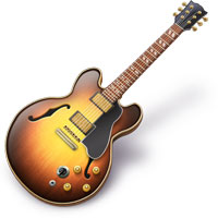
Is there such a thing as a perfect guitar? No. There is such a thing as the perfect guitar for you though. This is about my perfect guitar, which is none other than the PRS (Paul Reed Smith) SE Standard. It is perfect for me. The guitar was only $550, which in the realm of guitars is pretty cheep. I use past context because it was discontinued as I bought it actually. I was lucky enough to purchase the last one made in Camouflage. Within the next year they discontinued the SE Standard line all together. There are many reasons why I like this design. I like the shape of the body because it is very unique. The pickups on this guitar sound amazing for the styles I play. I play lots of metal, hardcore, rock, blues and occasionally reggae, a somewhat random range of tones but this guitar sounds good in all of them. It is very comfortable to sit down and play with. The way it is shaped makes it easy for you to lean against and lay your arm on. I love the cutaway on the bottom, most guitars have them nowadays but it makes it easy for soloing around the 22nd fret. This design caught my eye because of the color as well. I love camouflage, and the look of the black hardware against the camo is pretty awesome. Another reason is because it ways hardly nothing. As appose to my last guitar this one is as light as a feather. My last guitar was a replica of a Gibson Les Paul. Like I said before, there is no such thing as the perfect guitar. This is my perfect guitar though, its looks unique and performs amazingly. It fits me.
Greg
Friday, September 4, 2009
2009 CIvic Wheels
 Here is the a close up of the wheels for the 2009 Honda Civic Hybrid. I think that they are absolutely hideous. I think I know what they were going for when they designed them. I think because of all of the "go green" stuff nowadays, they tried to make the wheels look more environmentally friendly. They look kind of like flowers. The thick spokes resemble pedals, and the cap in the middle looks like the interior of a flower. There is too much material in them. They are almost dish wheels. I have no problem with people wanting to go green or whatever but if you have enough money to buy a hybrid at least buy new wheels. I think I would maybe reverse the amount of material and the amount of openings. I would definitely make the middle a lot smaller too. I realize that they were going for the flowery "green" look but, I think that this wheel design was a very bad choice. If anyone has any thoughts or feelings on these wheels, please let me know.
Greg
Subscribe to:
Comments (Atom)