 This movie has a very interesting design in color. It is very distinct looking and would be easily picked out in a crowd of screenshots. Frank Miller has been known for crazy looking color corrections. This movie is one of the most interesting looking films ever. I personally love the look of it. I have many times tried to recreate the extreme black/white/red look of it. I now know how to do it but, it took a lot of time for me to figure out. I think that this "look" would not work for all movies, but it works for this one. The movie is known for its look rather than its story. This color correction works really good in a movie with lots of blood, or red clothing in it. This movie has both. Obviously it was no mistake dressing the girl in red, but it still adds to the film. The red stands out like crazy and it gives more meaning to the red. It helps the filmmaker to make something stand out that might have been looked past in normal color correction.
Wednesday, October 28, 2009
Sin City
This movie has a very interesting design in color. It is very distinct looking and would be easily picked out in a crowd of screenshots. Frank Miller has been known for crazy looking color corrections. This movie is one of the most interesting looking films ever. I personally love the look of it. I have many times tried to recreate the extreme black/white/red look of it. I now know how to do it but, it took a lot of time for me to figure out. I think that this "look" would not work for all movies, but it works for this one. The movie is known for its look rather than its story. This color correction works really good in a movie with lots of blood, or red clothing in it. This movie has both. Obviously it was no mistake dressing the girl in red, but it still adds to the film. The red stands out like crazy and it gives more meaning to the red. It helps the filmmaker to make something stand out that might have been looked past in normal color correction.
Forza Motorsport 3
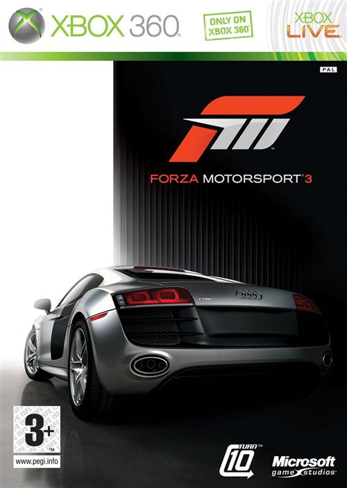 So I have sort of started a video game car theme lately, and this is a combination of both. I pre-ordered this game a few weeks back and have been eagerly waiting for its arrival. I absolutely loved Forza Motorsport 2 and hoped for similair gameplay in this one. I finally picked it up at midnight on monday night/tuesday morning. I played it until 3:30 in the morning and didn't want to stop. The only thing that held me back from staying up all night is the fact that I had a math exam on tuesday. The gameplay in this is amazing. They improved on a lot of stuff this time around. The graphics are just amazing. It is one of the most realistic looking games i've seen. The way that the cars handle in this game is better than the 2nd game. The handle incredibly realistic. I have not driven an Audi R8 in real life, but I would imagine that it would handle like it did in this game. One thing that lacked in Forza 2 were the backgrounds of the tracks. That is one thing they greatly improved on in this game. The background just blew me away. On the track "Maple Valley", It is set in a fall time period in a forest and the trees look really good. Their leaves are red/orange/yellow. It makes you think that it is fall when you race there. If you look too much though, you wreck. Another feature that is very useful in this game is the "rewind" feature. If you hit another car and dent your bumper, you can rewind back to a certain point and try again. I think this feature is genius. In the old game you would always strive to not hit anything to get the bonus at the end of the race. In this one you can try a few different ways if you mess up. Another thing in this game is that they have a little more variety in race styles. There are drift and drag races on top of the standard circuit races.Overall this game is a huge improvement on the last one, I can't wait to get farther into this game.
Take It All Away-Red
http://www.youtube.com/watch?v=iAHCsyOb3Rc
This song is "Take It All Away-Red". The design of this song is amazing. You probably didn't think that songs have designs, but they do. They are composed, recorded, and edited later on just like a graphic design or a video. More a video but the principle is the same. I love the layout of this song. It is laid back, calm, and slightly dark sounding all the way through the song, up until the end. If you have never heard the song before, I would recommend listening to it. I love the structure of this song. It is slow and acoustic, and then builds up and explodes into an amazing, powerful outro. I have heard a few artists do this before in songs, but Red really harnesses this structure and ended up designing an amazing song.
Nissan GT-R
 The Nissan GT-R. This car is my favorite. I have loved Nissan Skylines since I was a child and was ecstatic when I found out they were bringing it back to the states. They changed the name to GT-R, big deal. The design of this car is amazing. It has a sort of commanding aggressive look to it. The "face" (as discussed in class) of this car is mean looking. I would probably have hated it if it looked happy. I like how it is very sleek. Its low and wide, two features I love in cars. The overall attitude of the car is just powerful. The stock 20" wheels add to the look of the car a lot, and the quad exhaust just looks amazing. The price is another amazing feature of this car, starting at $80,790, this car out performs most porsches and all corvettes. They changed the body style a lot from previous Skylines, but they kept the signature quad taillights. There are different driver settings for this car. You can set it to automatic, or semi-auto, or racing semi-auto. Then you can adjust the suspension from luxury to racing. Then you can even turn off different safety settings to make it act more like a race car. Overall this car is amazing, design, price, attitude. This car is amazing in every way.
Wednesday, October 21, 2009
Borderlands
 My little brother pre-ordered this game a few weeks ago and picked it up yesterday. My older brother told me I should try it and it is the most fun game ever. I was kind of skeptical. My thoughts were along the lines of "Well it must be pretty good, but there is noway that it is the most fun game ever." I tried it last night and wow. This game is absolutely amazing. The game play is a little bit different to get used too, especially if you have "Halo reflexes" as I call them haha. I get attacked by stuff in this game and accidently throw a grenade at something 2 ft in front of me. instead of re-loading my gun. This game has everything you want in a game. It not only is a shooter, but you have vehicles, kind of have a home base, an unlimited amount of weapon choices. This game actually has its own software engineered into it, where it generates its own weapons. The creators of tis game will play it and find weapons that they have never seen before. I think that is one of the coolest ideas ever. It also makes it fun because you can try and collect different guns and compare them to your friends guns and its awesome. Another feature with the weapons thats cool is the fact that the weapons have different rarity ratings. It goes from a scale least rare to most rare. The scale goes white-green-blue-purple-orange. I haven't gotten any orange weapons yet but I have a purple one haha. The amo is over abundant in this game also. You never have enough room to carry all of the amo that you find. You also can buy and sell weapons. One feature that comes in very handy is; If you sell a something you didn't mean to sell, then you can buy it back for the same price as you sold it for. You can only do that while you signed in to the machine that buys and sells, but I think that feature is genius. I can think of many times in games when I have sold something that I can never get back in that game. It makes me very unhappy. They have thought of almost everything in this game.
 The only thing that I don't like about this game is the fact that you cannot customize your character that much. I mean sure you can change weapons and some colors of your clothing, but you cannot change facial features, clothing styles, hair color, etc. All you can do is choose from a few different characters. I really don't mind too much though. They made this game so awesome that you kind of forget about not being able to customize your character.
The cover art for this game is pretty awesome as well. The red background and the screenshot in the blood splatter is very well put together. It makes you look at it a few different times just to figure out what exactly is happening. It is not natural looking, but yet it is intriguing. It really draws you in.
All in all the game makers went all out in Borderlands. They really did think of absolutely everything when designing this game. The cover art makes you want to buy it, and the game play makes you not want to stop playing it. It is very addictive, but I don't mind getting addicted to this type of game.
Nokia 5310
 I bought this phone last year because I loved the design of the exterior. I researched it before I bought it, but there was not a whole lot of reviews or info due to the fact that it has just come out. In my eyes, it was orange (my favorite color) and it had an mp3 player on it (I love music). I thought that this phone was everything I wanted.
 Well unfortunately I found out quickly it wasn't. It has all kinds of glitches and flaws in its design. It is made more sleek and small so that it fits into pockets easier, which I like. The problem with it being small, is the fact that the first time I dropped it (about 2 1/2 ft), it broke the back cover. It didn't break it in half or anything like that, but it broke the clips on it so that it now hangs off in the one corner of the phone. Another problem I have had with this phone has been texting issues (everybody I've talked to that also has this phone has this problem as well). It locks up during texts, and after it locks up, the screen goes black then it resets the screen.
Some of the features I like about this phone is the mp3 player. It has very good quality sound. Even the built in speaker has good sound with receiving texts and phone calls. It comes with some very cool graphics for backgrounds, screen savers, etc. When talking to someone on the phone, the sound is very clear and easy to understand that person, unlike my last phone.
Overall I really like this phone, I just hope that they re-design some of the issues it has and make it amazing.
Facebook's Home Page Layout
Monday, October 12, 2009
Photo Booth
The Snuggie
 The Snuggie is a blanket that has sleeves so you can still talk on the phone, eat, text, etc, all while comfortably cuddled up under your Snuggie. Not a bad idea for being around the house. The way it is advertised however is a little different. They show people at football games, and public events with these stupid looking things on. Who in there right mind would wear one of these to there sons football/basketball/baseball/soccer games? I would feel awful for the kid whose parents wear these things to his outdoor sports event. I am sitting on my couch right now under a blanket with a sweatshirt on to keep my arms warm, sounds like I could use a Snuggie right? I would have a hard time choosing from all of there "fashionable colors" as they are advertised haha. Overall good design, bad marketing strategy.
Monster
Tuesday, October 6, 2009
Super Scratcher!!!
 At my house there are a total of four cats. Yes I live at home and commute to college. It is just cheaper. Back to the subject. My Mother enjoys buying lots of ridiculous cat products that the cats are hardly interested in. Until she bought the Super Scratcher. All of the cats absolutely love there things. My cat (I went to college in Tampa, Fl, lived in an apartment and adopted a cat from the humane society to keep me company. She has three legs.) heard my mom set up a new SS and came running in the room, diving on the SS and knocking off the other cat that had been sitting on it. It was one of the funniest things I have seen in a while. Bottom line is that the cats love these things. They are a great product. The only downfall is that you get some cardboard shreds around the house but they are easily vacuumed or sweeped up.
New Heinz Ketchup Bottle
 There are advantages and disadvantages to this new ketchup bottle design. Some disadvantages are that when you are trying to get the ketchup out you kinda have to squeeze hard and when it finally comes out it shoots with a lot of force behind it, potentially staining nice clothes if you aren't careful. Also if you are picky about food mixing (like I am) it also can get ketchup on food that you don't want it on.
 On the other hand, there are more advantages than disadvantages. This bottle eliminates the watery ketchupy stuff that you get with other bottle designs. This bottle design fits into your refrigerator door a lot better (which is what it was designed for). The top of this bottle doesn't seem to clog as much as the older versions. Also the top doesn't get covered in nasty ketchup like older bottles. Overall this design is a lot better than the older one. The fact that it doesn't get that watery stuff at the top sells me on the design.
Quad Bookcase

I found a picture of this thing online and wow is this crazy looking. I actually think as radical as this design is, it might actually be somewhat useful. Not exactly practical but useful. I think that you could possibly fit more books into a conventional shelving unit but none that look as cool as this. It mounts the books at angles, if you put the book in right, it would make it easier the titles easier to read. This shelf would look very nice in a modern decorated home.
Monday, October 5, 2009
Pool Vacuum Hose
 This is a pool vacuum hose. Many of you probably wouldn't recognize it if you saw it but thats what it is. I work as a Pool Technician during the summer and have for the past 3 years. I work with one of my best friends ad we always complain about these hoses. They are stiff and tangle up and collapse. They are incredibly hard to work with. You have to twist them until they are perfectly straight otherwise the make your life difficult. My friend and I have not yet come up with the solution or a new alternative to the vac hose, but we are working on it haha.
Dentist
I came upon this the other day and couldn't help but blog on it. This is the worst idea for a logo ever. It conveys the message that they are going to rip your teeth out! Not only that but with there bear hands and not surgical tools. I guess it probably wouldn't have looked any better with pliers holding the tooth either. This is just awful though. If I went to a new dentists office and saw this on the door I would most likely walk back to my car and speed out of the paring lot. The colors are inviting and give a relaxed feel but the design counters that feeling.
Fedex Ad

I came upon this ad while researching for a different class' project but I decided to blog on it. I think that this is an amazing design. This design sends a message to you. It communicates to you that Fedex Is a fast efficient service that will get your delivery places fast and safe. It reminds me of old cartoons when the characters would dig to china. I think they had those cartoons in mind when they created this design. It suggests that they have sent this vase around the world. I also like the way its put together. Very visually pleasing to the eye. They have arranged everything at angles oppose to vertical or horizontal lines. Diagnols are always more interesting I think. It also draws your eye to the Fedex on the side of the box which is exactly what they wanted to happen. So in my opinion this is a very successful, affective ad.
Subscribe to:
Posts (Atom)